

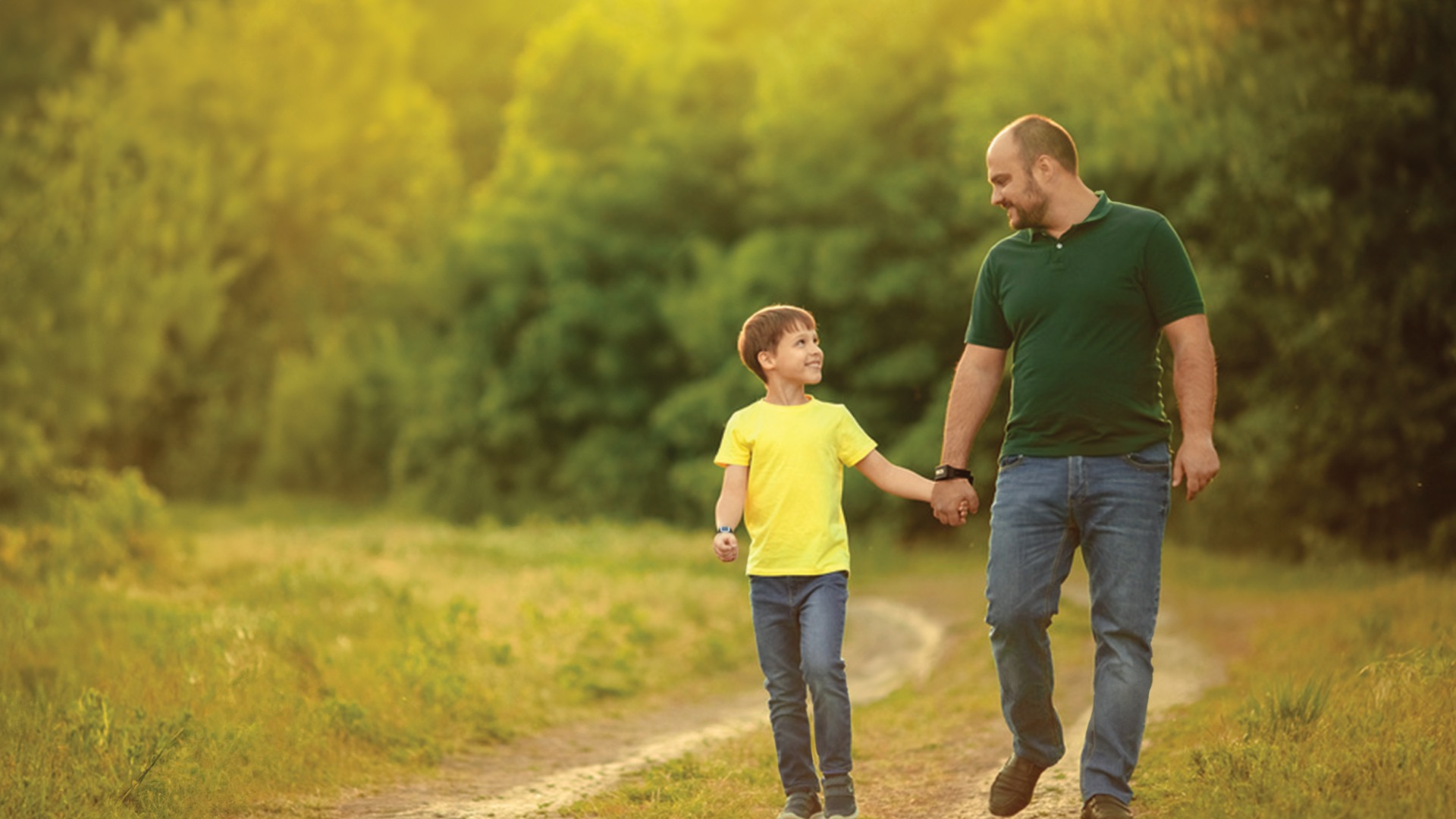
Move Monkey
Encouraging kids to get moving and get bonding!


Summary
Move Monkey is a simple exercise and bonding app that encourages parents and kids to get moving and get bonding. With our app parents and kids can exercise, have fun, and earn badges to show off to their friends, all while they stay moving and get that important bond session. This is all done with the help of state of the art smart watch technology, location tracking, and badge feature. It is our goal to help parents establish a stronger connection with their children, all while helping th
My Contributions
I helped contribute during all stages of the project and design thinking process and assisted with the execution. Most of the work that I contributed the most was during the ideate stages of the project where we designed the activities, badges, and activity summary screens which helped combine the physical activity with the bonding aspects of the app. I also helped develop the color scheme of the app to help convey a friendly and easy to use atmosphere within the app.
The Problem
Numerous families struggle with the challenges of a sedentary lifestyle, often due to increased screen time, which can hinder meaningful engagement and connection among family members.
In today's fast-paced world, sedentary lifestyles are prevalent among both children and adults, influenced by busy schedules and technology. This affects family dynamics, as children often imitate their parents' behavior, leading to less physical activity and bonding.
The Solution
A simple application that encourages parents and kids to increase their bond and do activities/exercises together through an Apple Watch or our own specially design smart watch. Together they earn badges.
By working out with your children, you can get to know each other better, bond over a shared experience, and build better family trust.
Design Thinking Process
Research
Empathize
Task Analysis
Storyboard
Technology
Define
Userflow
Sketches
Ideate
Prototype
(Lo-Fi) & Test
Lo-Fi Wireframes
Evaluation
Prototype
(Hi-Fi) & Test
Moodboard
Hi-Fi Prototype V.1
Heuristic Evaluation
Hi-Fi Prototype V.2
Empathize
Research
“Children who engage in sedentary behaviors are at an increased risk for various negative health outcomes, including obesity, type 2 diabetes, cardiovascular disease, and poor mental health”
“1 in 4 white US adults spend about 70% of their waking hours sitting”
- National Institute of Health
“It is known that the physical activity levels of children and among youth and parents are correlated; therefore, inactive parents will more likely have inactive children.”
“Exercise will also help boost your emotional bond through coordinated actions and mimicry.”
- National Library of Health
Define
Task Analysis
A task flow diagram is a clear description of goal(s), tasks, and activities. My group and I broke down our ideal path of activities into it’s crucial steps. Doing this allowed us to focus our attention and efforts into the important and necessary functions of our app. This served as an important step in sorting our thoughts and utilized our project management skills.
Define
Storyboarding
A storyboard is a simple graphical way of depicting what the ideal scenario for our consumer and serves as a way for us to visualize how our consumer may use our app. The storyboard consists of important steps and activities the consumer will partake in to progress within the app.
Define
Technology
The technology that we intend for the app to use is a smart watch that is designed for the app, or the user can opt to connect to an already owned smart watch of their own. The app will connect to the users watch via bluetooth. The app will also utilize location tracking to keep track of current and past activity routes.


Define
User Flow
The user flow functions as a way for us to visualize in greater detail specific steps and actions that the user will take and what those actions will lead to. This helped us organize our thinking process and helped us define ways to streamline our apps functions to avoid redundancy.
Ideate
Sketches
The sketches for the wireframes were rough drawings to help us illustrate our ideas into what could potentially be executed, this helped us put our ideas on paper and figure out what would and wouldn’t work in execution. This also helped us gather feedback at an early level before committing on any major design decisions.
Prototype (Lo-Fi) & Test
Lo-Fi Wireframes
The Lo-Fi wireframes are the next step from the sketches where we actually turned the sketches into visual prototypes to give us a structure to what the app may look like in a gray-scaled format. This allowed us o gather further feedback while we were still early in the design stage.
Prototype (Lo-Fi) & Test
Evaluation
Some notable comments that we received after the evaluations was that; we needed a greater emphasis on how we were going to encourage bonding throughout our app, more diverse options in terms of what watches are compatible with the app, a possible way of sharing badges on social media, and a stronger emphasis on the app being kid friendly.
With this valuable feedback in mind, we proceeded on to the High Fidelity prototype and testing.
Prototype (Hi-Fi) & Test
Moodboard
For our moldboard, we all collectively decided that we wanted a colorful but not overbearing color scheme, so we decided on a careful balance of warm and cool colors for our direction.
Prototype (Hi-Fi) & Test
Hi-Fi Wireframes V.1
After incorporating our moodboard color scheme into our wireframes, we began working on consistency errors and readability within our app to work with the added color scheme. We added the function to log in as well as a terms and service, clearer choices of activities, and a clearer summary screen.
Prototype (Hi-Fi) & Test
Heuristic Evaluation
After an extensive round of critiques and reviews from our fellow peers, we received some invaluable feedback regarding some consistency issues regarding our:
Home Screen
Activities Screen
Summary Screen
Old

New

Homepage
Old

Hi-Fi Prototype V.2
After receiving the valuable feedback, we got to work and implemented changes and improvements immediately. We changed the home screen to have a clearer call to action and implemented contacts in a way similar to instagram stories. We also added function to click and view most recently finished activities. We restructured the activities screen to be an overlay pop up to reduce the amount of different screens required to go through o start a task. Finally, we restructured the summary screen to be more visually appealing
New

Activites
Old

New

Summary
Interactive Prototype
Landing Page
Conclusion & Reflection
Designing this app has been an invaluable experience that helped me exercise the fundamentals of user interface and user experience and has provided me with further insight on how the industry may function as well as serving as a very important stepping stone in my design career. This project has allowed me to dive deeper into the functions of Figma and how it works and possible applications for it outside of simple app design. This project has also provided me with a space to work within a team and how to collaborate within that team, from delegating work to assisting each other on objectives and tasks, this has proven to be a very invaluable experience. Overall, this project has allowed me to further develop my understanding of UI/UX, collaborative teamwork, project management, and deepened my design thinking skills.