

The Overview
Zoo’s are a common place where people go to see animals that they normally won’t see in their local area, so due to a common and recurring audience and demographic a contemporary identity is necessary for a modern zoo.
So I embarked on a project in developing a cohesive symbol system and a poster for a local zoo using nine animals from three different categories. We were given the choice from 3 mammals, 3 birds, and 3 insects. In addition to this the animals must also be exotic.
The Challenge
The animals I chose were the Fennec Fox, Snow Leopard, Zebu, Crested Penguin, Grey Crowned Crane, Rhinoceros Hornbill, Asian Longhorn Better, Giant Walking Stick, and Emperor Scorpion. In order to properly understand what I was making I researched the animals extensively so that I will be knowledgable of the nuances of the animals when designing the symbols.
The objective was to research our selected animals and discern special characteristics, this was to help us understand the
importance of research, documentation, and writing as a part of
our design process.


The Solution
For the symbol system, I had to really refine them so that they were simultaneously simple but still conveyed the defining features of each animal. For the mammals, the proportion of the body to the legs was important. The birds, they beaks and legs were their defining feature so I had to make sure they had emphasis. For the insects, the legs were the main feature that will sell the insect design.
After developing the symbol system, my next goal to make sure that I understood how to utilize the symbols was to use them in a letterform. This would train me to look at my symbols with an objective eye so that I saw the positive and negative space instead of the animal itself.
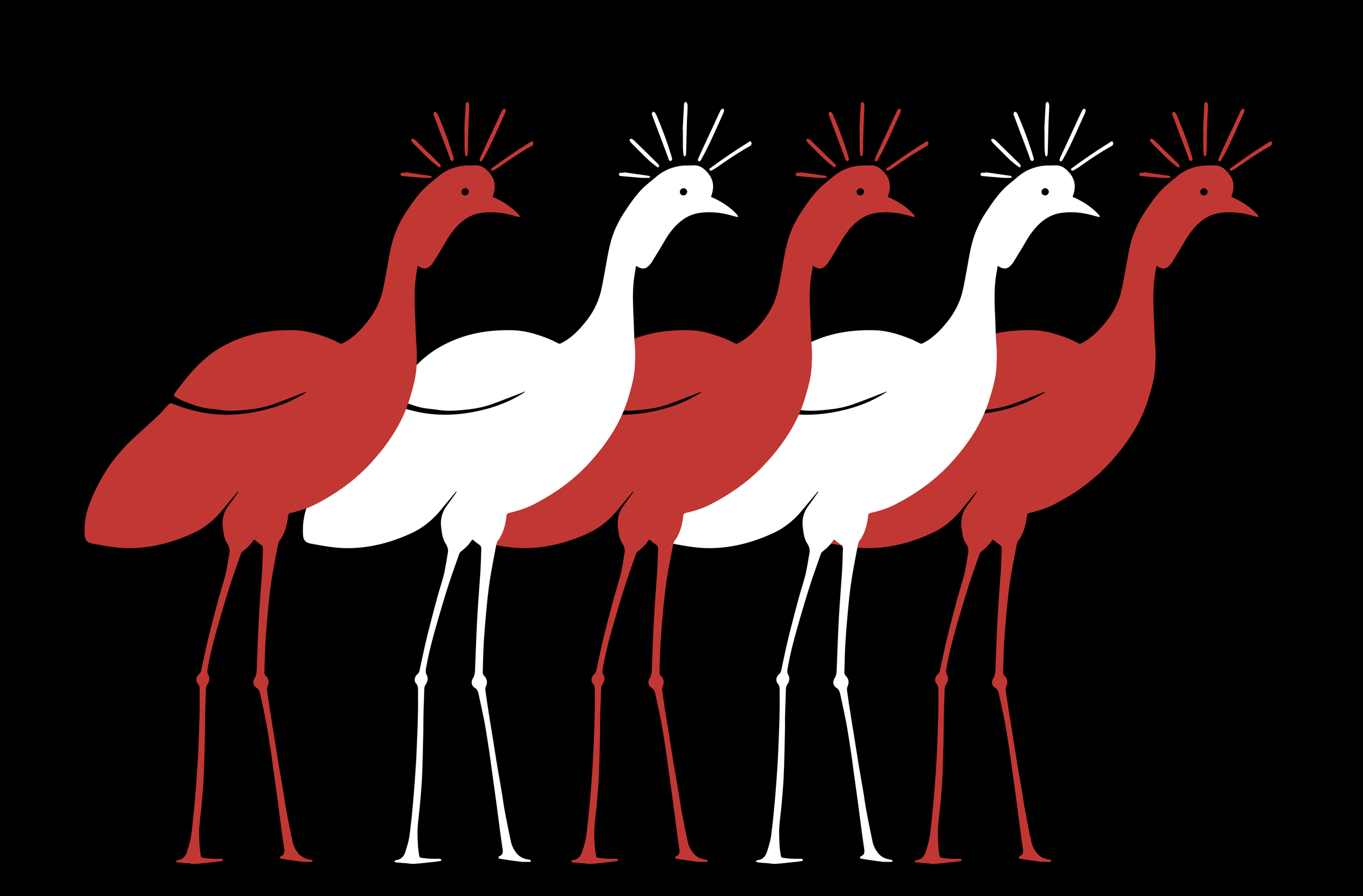
For the final poster, my goal was to design a call to action poster about the endangered Grey Crowned Crane. Throughout the iterations of the poster I had to struggle with how the information was portrayed and communicated.
The crane symbol itself had to go through extensive reiterations throughout this process. I also experimented with color, from grey and gold to red and black. In the end I decided on a red to black composition that focuses more on the cranes themselves and their endangered status and focus less on the cranes information.


